 VIP HOME PAINTING
Visualize it. See it. Paint it.
(909) 312-5400
VIP HOME PAINTING
Visualize it. See it. Paint it.
(909) 312-5400
3 Ways to Choose Between Three Identical-Looking Whites Without Guessing
On a paper card they are the same. On your house, in your village, they are not.
One House, Three Directions
Try the principle here first. Pick a direction and tap through the palettes — the home below re-paints itself in real time so you can watch how much a small shift in undertone changes the whole elevation. Then we do it with your house.
Where it starts
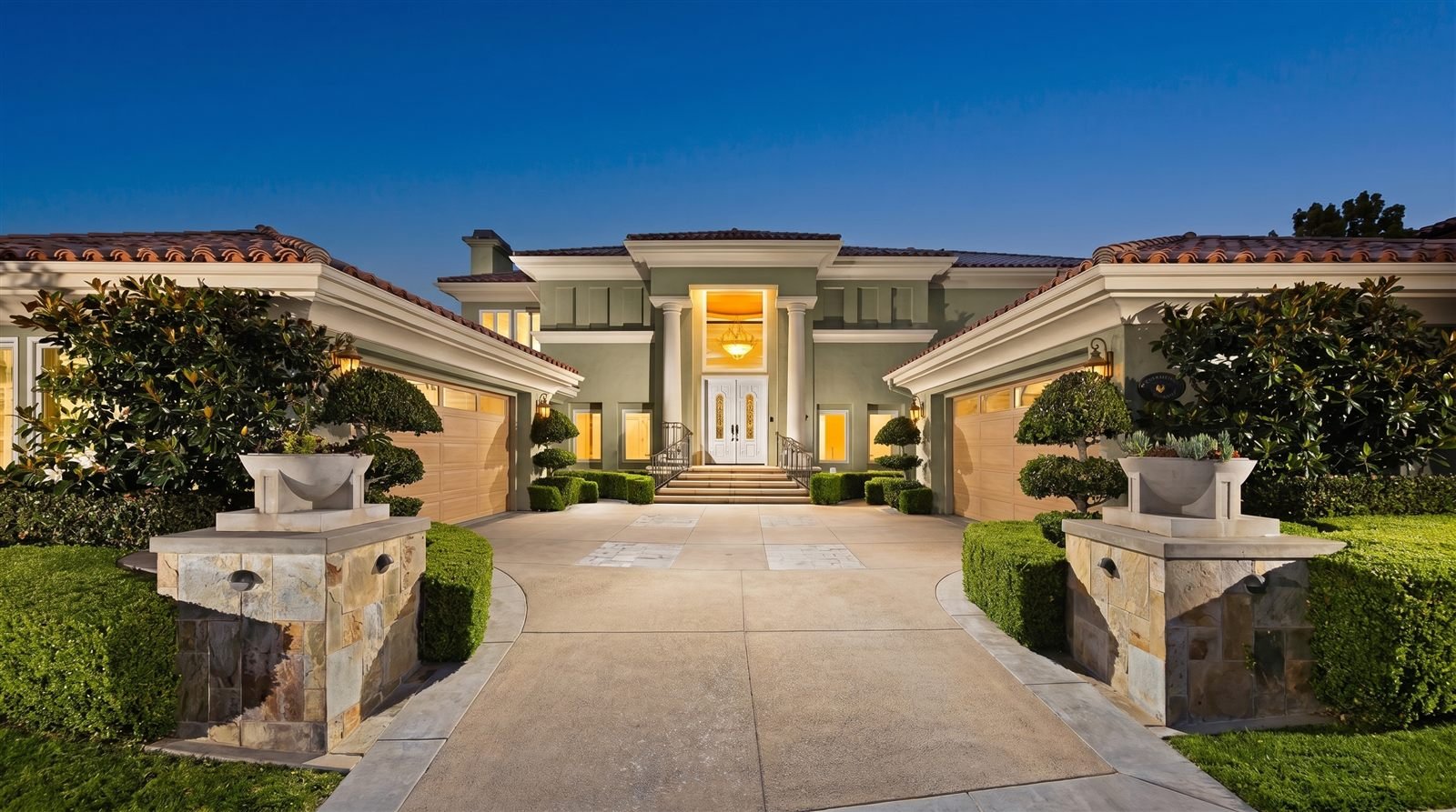
One real home, photographed as it stands. Everything below is this same house — same walls, same roof, same light.
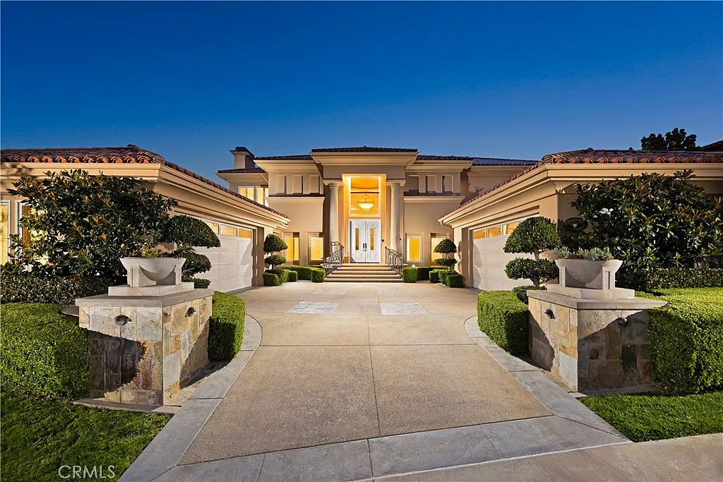 Before
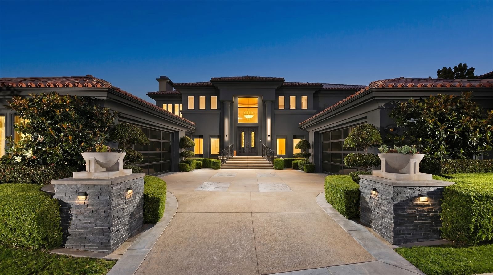
The same house, decided differently
Not swatches held against a wall — the finished result, rendered before anything is scheduled. This is a few of the directions; the full library sits on the main page.
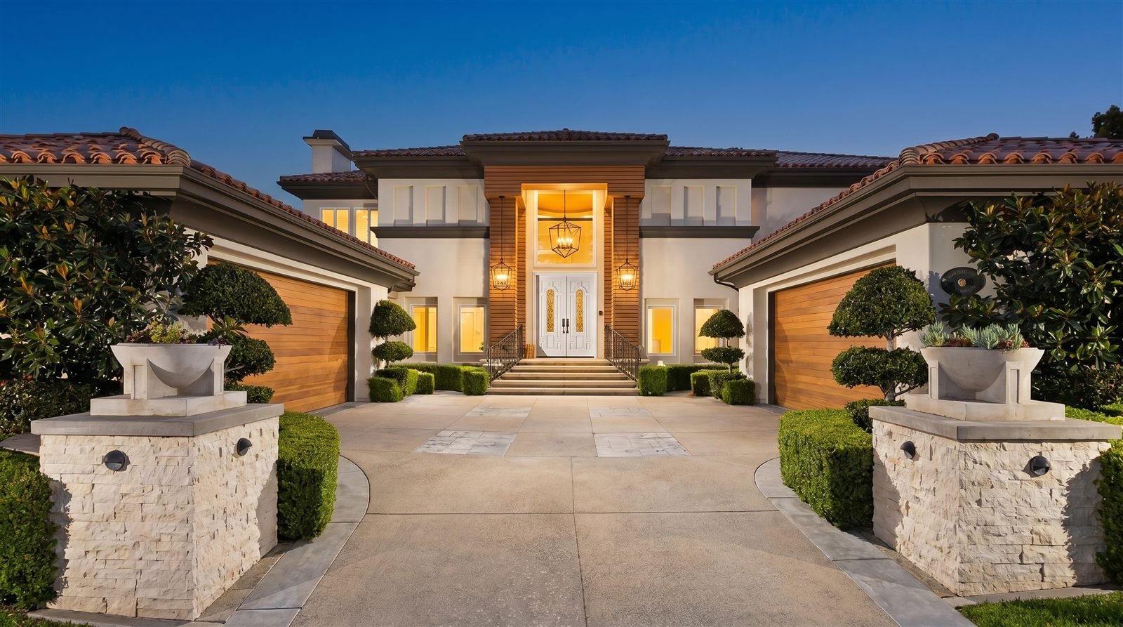
Then the details
Fixtures change an elevation after dark as much as color changes it at noon.
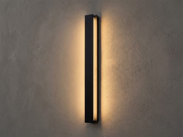
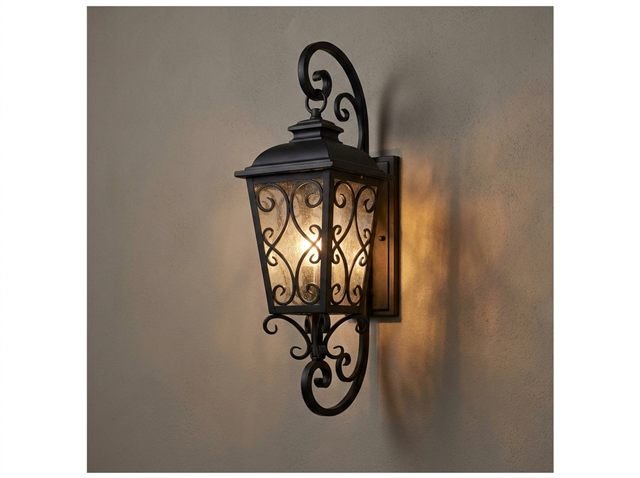
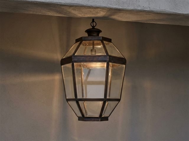
Every image above is a rendering of one real home. The next one is yours. Our design team renders your actual elevation in every palette you are considering, at no cost, before anything is scheduled.
Claim Complimentary Color ConsultationSee your home in every color before a single gallon is tintedYou have narrowed it to three whites. Side by side on the counter they are indistinguishable — three slightly different pieces of white paper.
On two thousand square feet of stucco, in Irvine sun, next to a clay tile roof, they are not remotely the same. One will look crisp and composed. One will go faintly yellow by mid-afternoon. One will read cold and slightly blue on the shaded elevation.
There are two published numbers that tell you most of this before you commit, and one way to be certain.
To distinguish between white exterior paint colors that look identical on a chip, use three things in order:
- Light Reflectance Value (LRV) — the manufacturer’s published 0–100 figure for how much light the color reflects. Higher reads brighter and flatter in strong sun; lower holds more depth and shows shadow
- Undertone — the faint hue underneath the white, usually yellow, greige or gray. This is what decides whether it harmonizes with your roof and stone or fights them
- Seeing it rendered on your own elevation — the only step that accounts for your village’s light, your texture, and everything you are not repainting
Five whites people actually shortlist in Irvine
These are Sherwin-Williams whites that appear repeatedly across the villages we work in. LRV is the manufacturer’s published Light Reflectance Value.
| Color | LRV | Undertone | Where it tends to hold in Irvine |
|---|---|---|---|
| Pure White SW 7005 | 84 | Near-neutral, very slightly warm | Contemporary elevations with broad flat planes — Altair |
| Greek Villa SW 7551 | 84 | Warm, subtle yellow and beige | Filtered, shaded light — Woodbury’s garden paseos |
| Snowbound SW 7004 | 83 | Slight gray — a cool white | Smooth-troweled stucco and canyon light — Hidden Canyon |
| Alabaster SW 7008 | 82 | Soft warm, creamy yellow-beige | Widely used; goes yellow on hot west-facing slopes |
| Shoji White SW 7042 | 74 | Warm greige, noticeably deeper | Bright foothill exposure where a high-LRV white would glare |
LRV and undertone are the manufacturer’s published characteristics. Confirm against a current physical chip before finalizing, and treat any on-screen color as an approximation.
1Read the LRV before you read the name
Light Reflectance Value is a number from 0 to 100 describing how much visible light a color reflects. Pure black sits near 0; the brightest available whites approach the high 80s. Sherwin-Williams publishes an LRV for every color they make, and it is the most useful single number in the entire selection process.
The reason it matters more outdoors than indoors is that exterior light is not adjustable. An LRV of 84 in full Irvine afternoon sun on a west-facing wall is genuinely bright — bright enough that architectural detail flattens out and shadow lines disappear. Drop to the mid-70s and the same elevation keeps its depth.
The practical rule: the more direct sun an elevation takes, the more you should question a very high LRV. On a shaded or filtered elevation, high LRV is what keeps the house from looking dull.
Alabaster at 82 and Shoji White at 74 are only eight points apart on paper. On a sunlit stucco wall, that is the difference between crisp and glaring.
2Find the undertone, because that is what will clash
No white is actually white. Every one has a faint hue mixed underneath — most commonly yellow, beige, greige or gray — and that undertone is invisible on a card and unmissable on a house.
The way to see it is by comparison, not in isolation. Put your candidates against a sheet of plain printer paper, which is close to a true white. The undertone that was invisible a moment ago becomes obvious: one card goes creamy, another goes distinctly cool.
Then hold them against the things you are not changing. A warm creamy white next to a terracotta tile roof reads harmonious. The same white next to cool gray slate can read dingy. A cool gray-undertoned white against warm stone can read faintly blue. This is where whites actually fail — not on their own merits, but against the fixed elements.
- Warm undertone — Alabaster, Greek Villa. Harmonize with clay tile, terracotta, warm stone and wood
- Cool undertone — Snowbound. Sits well with gray roofing, slate, black window frames and contemporary detailing
- Near-neutral — Pure White. The most flexible, and the least forgiving of imperfect preparation
- Greige — Shoji White. Reads as a white at a distance and as a warm neutral up close
3Then see it on your own house, because the first two only narrow it
LRV and undertone will reliably get you from thirty candidates to three. They will not pick the winner, because neither number knows anything about your specific house.
They do not know your elevation faces west into afternoon sun coming off the Orchard Hills ridge. They do not know your roof is terracotta and throws warm light onto the fascia all day. They do not know your stucco carries a heavy texture that will read the color two steps deeper, or that your neighbor’s mature landscaping puts a cool cast on the north side every morning.
That is the gap the Custom Visualization Service closes. Our design team renders your actual home — your elevation, your roof, your surroundings — in each of the finalists, so the decision is made by looking rather than imagining. It costs nothing, it happens before anything is scheduled, and it takes about thirty minutes.
Questions people ask
What is LRV and why does it matter for exterior paint?+
How do I see the undertone in a white paint color?+
What is the difference between Alabaster and Greek Villa?+
Is Snowbound a warm or cool white?+
Which white is best for an Irvine home?+
Seeing It First
A wrong exterior color costs the entire project again — four to seven thousand dollars for a typical Irvine home, plus the weeks and the living with it. And almost nobody who ends up regretting their color ever looked at it on their own facade before the crew arrived.
That is the whole reason our design team renders your actual home in every palette you are considering, at no cost, before anything is scheduled. You approve a color you have already seen on your own house. It takes about thirty minutes.