 VIP HOME PAINTING
Visualize it. See it. Paint it.
(909) 312-5400
VIP HOME PAINTING
Visualize it. See it. Paint it.
(909) 312-5400
Avoid the $7,000 Repaint: What Goes Wrong When You Choose a Color From a Swatch
Almost nobody who regrets their exterior color ever saw it on their own house first.

One House, Three Directions
This is the point. Pick a style direction below and tap through the palettes — the home re-paints itself in real time. It is a demonstration of what our design team does with your actual elevation during a complimentary consultation: you see the color on the house, in context, before a single gallon is tinted.
Where it starts
One real home, photographed as it stands. Everything below is this same house — same walls, same roof, same light.
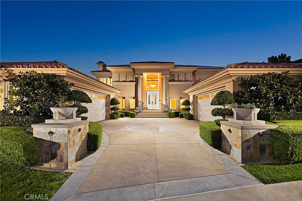 Before
The same house, decided differently
Not swatches held against a wall — the finished result, rendered before anything is scheduled. This is a few of the directions; the full library sits on the main page.
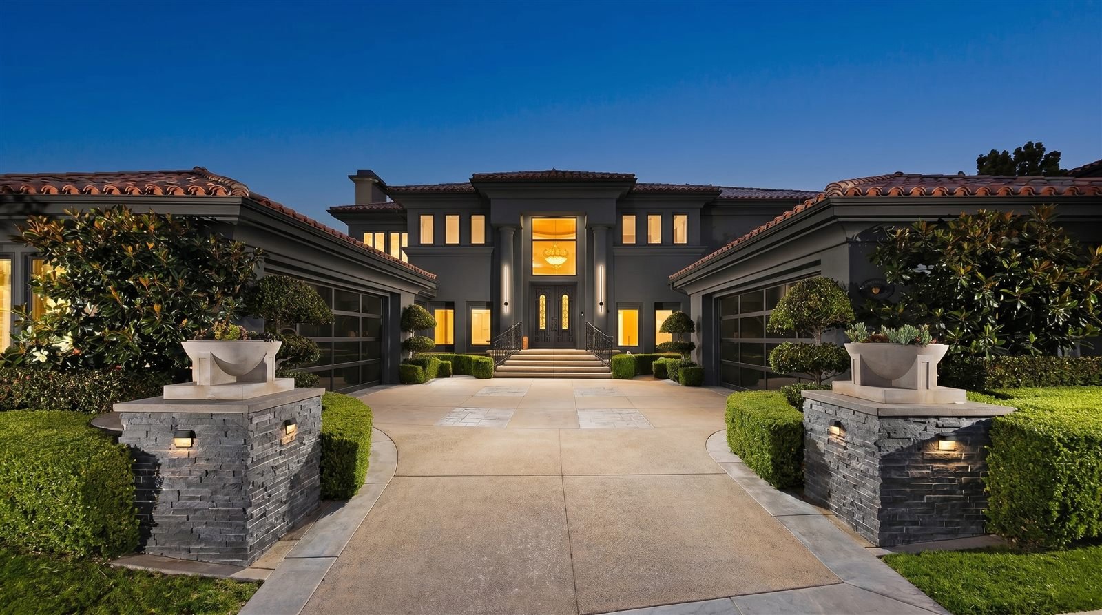
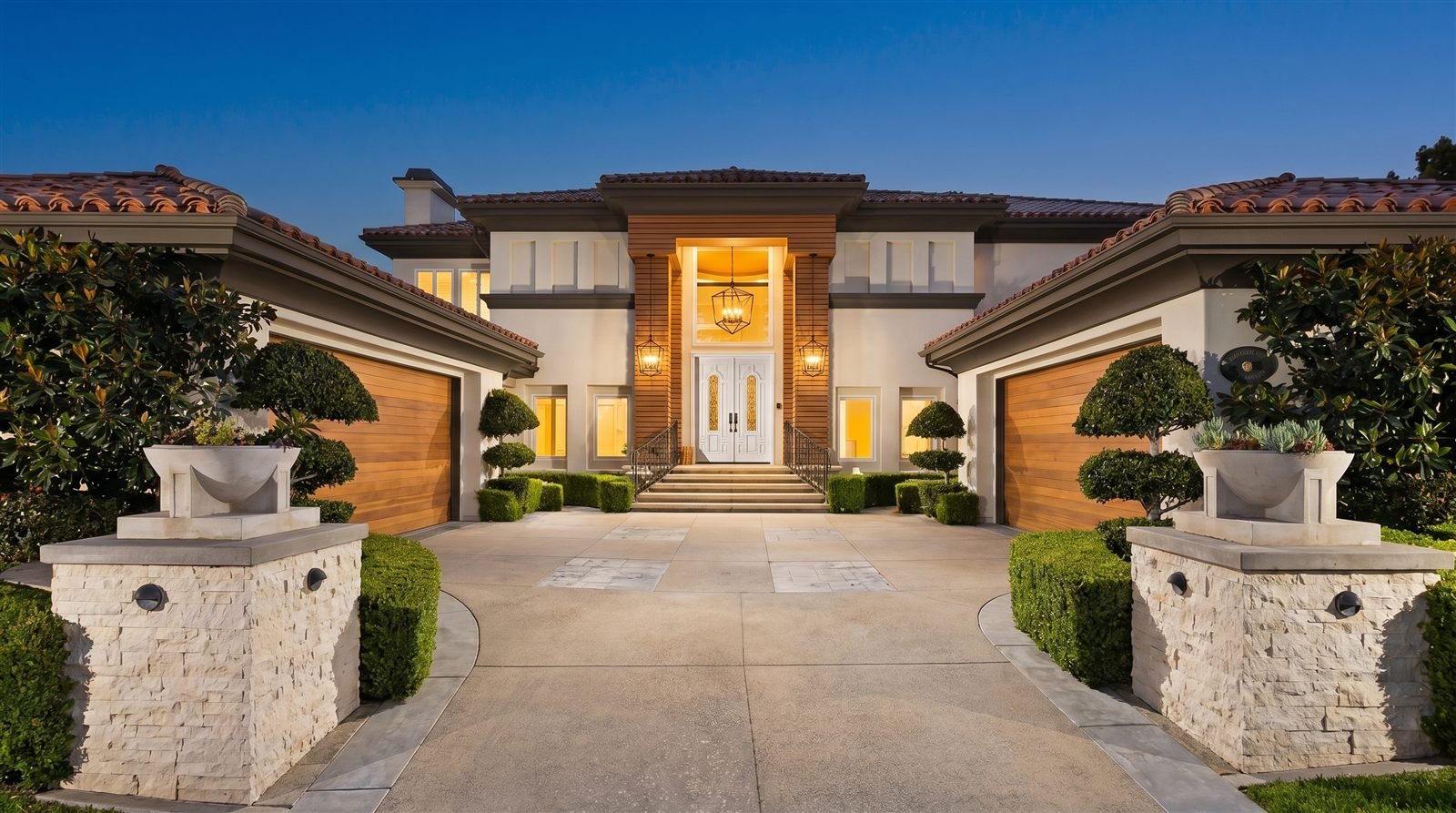
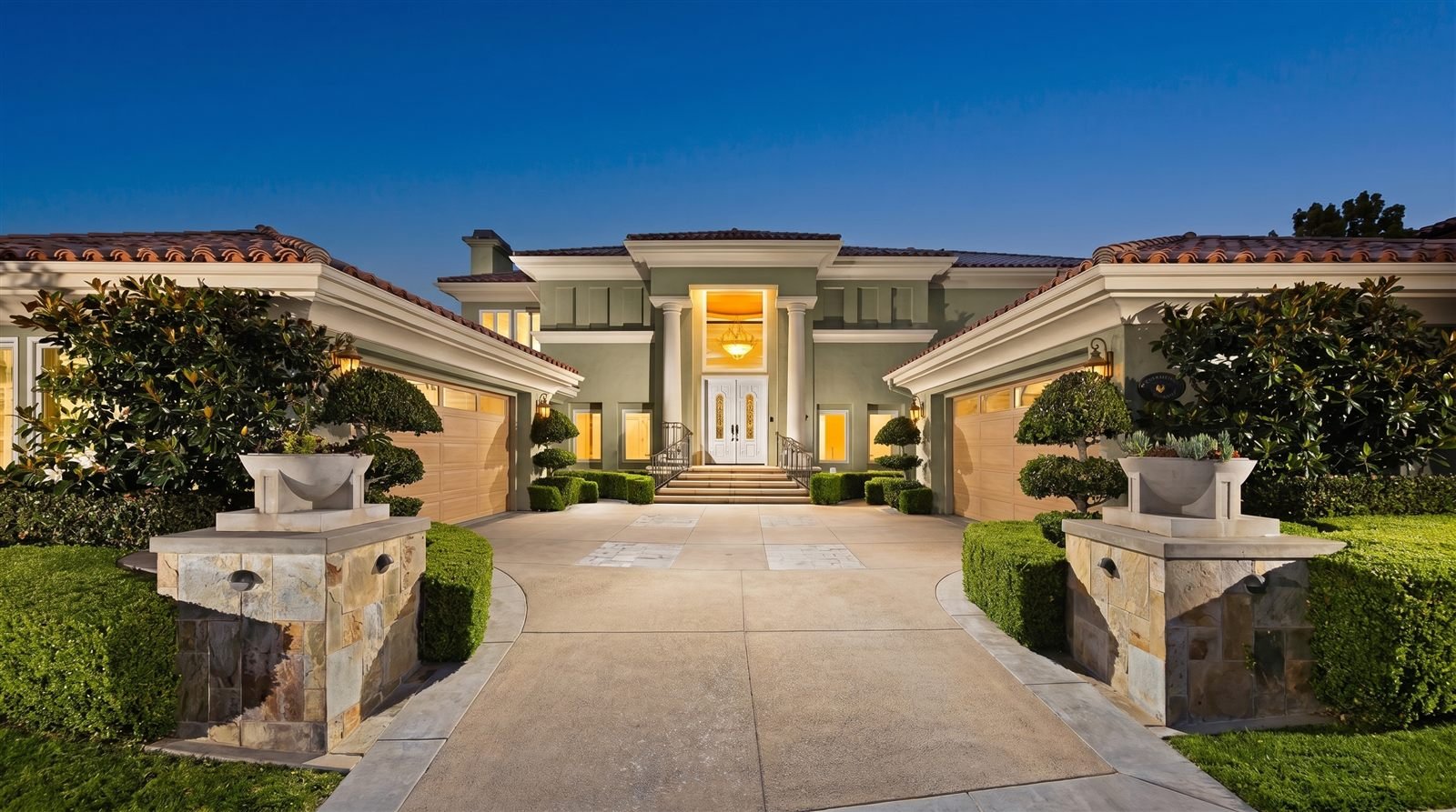
Then the details
Fixtures change an elevation after dark as much as color changes it at noon.
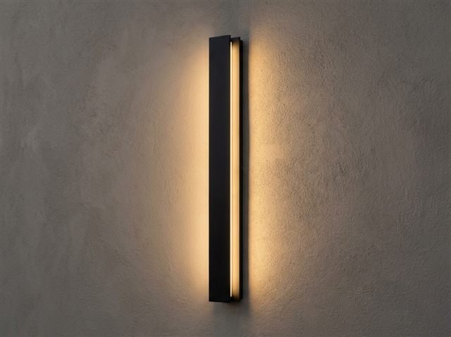
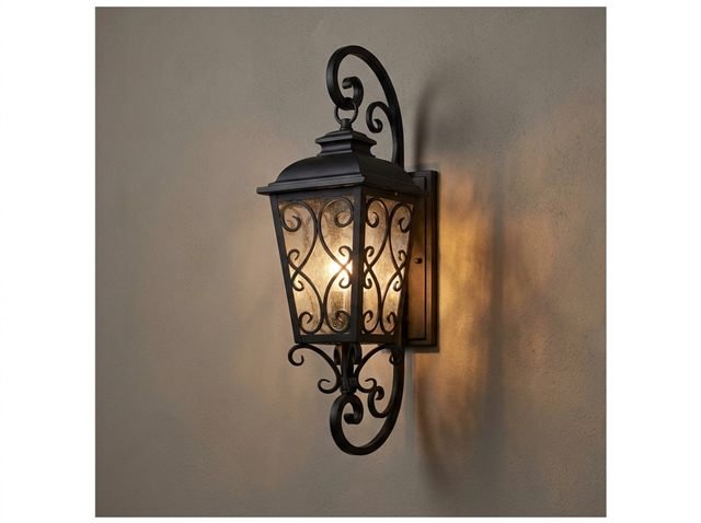
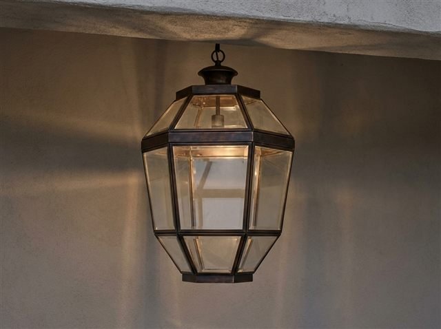
Every image above is a rendering of one real home. The next one is yours. Our design team renders your actual elevation in every palette you are considering, at no cost, before anything is scheduled.
Claim Complimentary Color ConsultationSee your home in every color before a single gallon is tintedThe card is two inches wide. It is printed on flat paper. You are looking at it indoors, under a fluorescent fixture, holding it next to four other cards that are also two inches wide.
The wall is two thousand square feet of textured stucco in full Southern California sun, next to a clay tile roof you are not replacing and a stone wainscot you are not touching.
These are not the same color, and they were never going to be.
An exterior paint color chosen from a swatch frequently looks wrong on the finished house for four reasons that are all predictable and none of which are the painter’s fault:
- Scale — the same pigment reads dramatically more saturated across a large surface than on a small card
- Light — direction, time of day and surrounding reflected color shift how a paint appears, and in Irvine that shift is severe
- Texture — stucco casts thousands of micro-shadows that paper does not, which reads visually darker
- Fixed elements — roof tile, stone, hardscape and window frames are not changing, and the new color has to live with them
The same color is a different color at scale
This is a well-documented perceptual effect and it catches almost everyone. A hue viewed across a large area appears more intense and more saturated than the identical hue viewed on a small sample. A beige that looked restrained on a card can read distinctly gold across an entire elevation. A soft gray-green can arrive at full strength as something closer to sage.
The practical consequence: people routinely choose one to two steps stronger than they meant to, discover it at the moment the crew pulls the masking, and then have to decide whether to live with it or pay for the whole job again.
Irvine light is not one light
The villages of Irvine sit at different elevations with genuinely different exposure, and that does more to your color than most homeowners expect.
In Woodbury, mature landscaping and garden paseos keep much of the community filtered and cool through the day, which flatters warmer whites that would go brassy elsewhere. On a west-facing slope in Orchard Hills, that same warm white takes direct afternoon sun off the ridge and reads yellow. Hidden Canyon gives you two different conditions in a single day — cool, often marine-influenced mornings, then hot open afternoons — so a white that feels refined at noon can go noticeably cold by evening.
Same paint. Same wall. Different hour, different village, different color.
A color is not a property of the paint. It is a property of the paint, the surface, the light, and everything nearby that is reflecting into it.
Stucco is not paper
A paint chip is a flat, smooth, matte printed surface. A stucco wall is a landscape of peaks and valleys, and every one of them casts a small shadow.
The visual result is that the same color reads meaningfully deeper on stucco than on the card, and the effect gets stronger the heavier the texture. A smooth-troweled finish, like much of Hidden Canyon, behaves differently again — it holds the color closer to true, which is precisely why any imperfection in the preparation is visible from three feet.
Sheen compounds it. The same color in a higher sheen picks up more directional light and appears to shift through the day, while a flatter finish holds steadier but shows surface irregularity more readily.
The things you are not repainting decide more than you think
Your roof is staying. So is the stone wainscot, the driveway, the window frames, and in most Irvine villages a good deal of hardscape and mature planting.
Every one of those surfaces reflects color back onto the wall. A terracotta tile roof throws warm light down onto the fascia and upper body all day. Large expanses of green landscaping push a subtle cool cast onto shaded elevations. A warm-toned stone base can make a neutral gray body read faintly lilac by contrast — an effect nobody predicts from a card and everybody notices on the finished house.
This is the failure mode that produces the most regret, because the color is not wrong in isolation. It is wrong next to the four things that were always going to stay.
What getting it wrong actually costs
A wrong exterior color is not a touch-up. It is the entire project again — full preparation, full material, full labor — because the surface has to be recoated in its entirety for the finish to be uniform.
For a typical Irvine home that is four to seven thousand dollars, paid a second time, plus another stretch of weeks with the house staged and the crew on site. And in a design-review community it can also mean a second submittal to the association.
Against that, the cost of being certain in advance is thirty minutes.
- Expect any color to read stronger and deeper on the house than on the card. Almost everyone chooses a step too strong.
- Judge a candidate color at three different times of day, on the elevation that actually faces the sun.
- Hold it against the roof, the stone and the hardscape — the things you are not repainting are half the decision.
- A repaint to fix a color is the whole project again, not a touch-up.
- The only reliable test is seeing it on your own house before anything is scheduled.
Questions people ask
Why does my paint look different on the wall than it did on the swatch?+
Should I paint a test patch on the house first?+
How much does it cost to repaint if I choose the wrong color?+
Does the roof really affect what exterior color I should choose?+
Seeing It First
A wrong exterior color costs the entire project again — four to seven thousand dollars for a typical Irvine home, plus the weeks and the living with it. And almost nobody who ends up regretting their color ever looked at it on their own facade before the crew arrived.
That is the whole reason our design team renders your actual home in every palette you are considering, at no cost, before anything is scheduled. You approve a color you have already seen on your own house. It takes about thirty minutes.